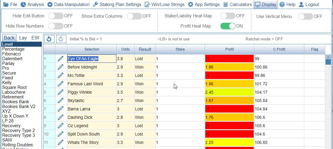
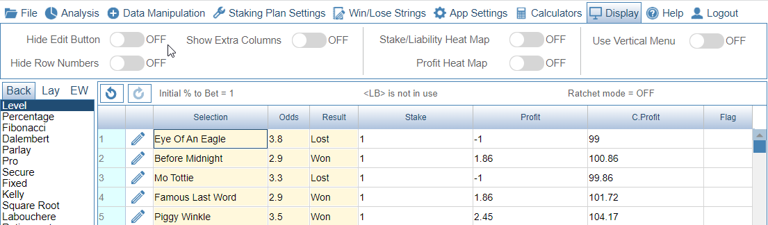
Screenshot shows Horizontal Menu in use. First image shows Profit Heat Map switched off.
Second image shows Profit Heat Map switched on. This causes the Profit Column to be shown as a heat map. Red being bad. (largest stakes). Green being good (lowest stakes).